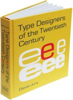
New Typographic Design
author: David Jury
compiler and designer: Roger Fawcett-Tang
publisher: Laurence King, London
date: 2007
A linked series of essays on typographic purpose and outcome. The introduction, Fads, Freaks and Fancies, outlines 19th century manifestations of graphic design, a theme expanded upon in Graphic Design before Graphic Designers.
The four other essays are: The Pleasure of Silence, The Pleasure of Noise, The Pursuit of Chaos and the Pursuit of Order.

Review by Angelynn Grant
Communication Arts, 2007
British designers David Jury and Roger Fawcett-Tang have assembled a vast array of new work (most done in the last two years) by a variety of designers (with a slight leaning towards the UK) that highlights the always shifting balance between form and function in modern typography. Examples include posters, books, packaging, signage and digital/video typography. Author and designer have divided the work into four sections, presenting a different way to approach the type in a project: type as form, as image, as experiment and in motion.
Sections begin with an overview of the difficulties inherent in each approach: the historical sentiments towards legibility and the silence of text type; the need to compete with the noise of vernacular typography in the environment, while simultaneously employing similar hand-drawn techniques; the sport in searching for the unexpected in experimental typography and the need as vernacular typography becomes more homogenized and boring; and the challenges to both communicate and attract when either the type is moving (animation and video) or the reader is (signage).
The sampled work is clean, fresh, modern, attractive and colorful: Experimental Jetset’s updating of the simple Swiss style in their visual identity and posters for De Theater Compagnie; Non-Format’s evocative use of silhouetted images and letterforms as a visual tie-in to the imagery of music in CD packaging and their work for The Wire; BB/Saunders sinuous visual identity for Tabooboo, an upscale sex shop; and Peter Anderson/Interfield Design’s impressionistic animated type in the title sequence for the TV show Bleak House. Captions point out the elements that make each a successfully innovative use of type.
David Jury’s clear writing and considered analysis makes New Typographic Design a good reference for young designers and the variety and creativity shown in the over 500 illustrations makes it an excellent source of inspiration for everyone.


